
The Grid View
Many web pages are based on a grid-view, which means that the page is divided into columns:
A responsive grid-view often has 12 columns, and has a total width of 100%, and will shrink and expand as you resize the browser window.

Using a grid-view is very helpful when designing web pages. It makes it easier to place elements on the page.
Building a Responsive Grid-View
To building a responsive grid-view, first ensure that all HTML elements have the box-sizing property set to border-box. This makes sure that the padding and border are included in the total width and height of the elements.
Add the following code in your CSS:
* {
    box-sizing: border-box;
}
.menu {
    width: 25%;
    float: left;
}
.main {
    width: 75%;
    float: left;
}
The example above is fine if the web page only contains two columns. However, we want to use a responsive grid-view with 12 columns, to have more control over the web page. First we must calculate the percentage for one column: 100% / 12 columns = 8.33%. Then we make one class for each of the 12 columns, class="col-" and a number defining how many columns the section should span:
CSS:
.col-1 {width: 8.33%;}
.col-2 {width: 16.66%;}
.col-3 {width: 25%;}
.col-4 {width: 33.33%;}
.col-5 {width: 41.66%;}
.col-6 {width: 50%;}
.col-7 {width: 58.33%;}
.col-8 {width: 66.66%;}
.col-9 {width: 75%;}
.col-10 {width: 83.33%;}
.col-11 {width: 91.66%;}
.col-12 {width: 100%;}
All these columns should be floating to the left, and have a padding of 15px:
[class*="col-"] {
    float: left;
    padding: 15px;
    border: 1px solid red;
}
Each row should be wrapped in a <div>. The number of columns inside a row should always add up to 12:
HTML
<div class="row">
  <div class="col-3">...</div>
  <div class="col-9">...</div>
</div>
The columns inside a row are all floating to the left, and are therefore taken out of the flow of the page, and other elements will be placed as if the column does not exist. To prevent this, we will add a style that clears the flow:
CSS
.row:after {
    content: "";
    clear: both;
    display: block;
}

<!DOCTYPE html>
<html>
<head>
<meta name="viewport" content="width=device-width, initial-scale=1.0">
<style>
* {
    box-sizing: border-box;
}
.row:after {
    content: "";
    clear: both;
    display: block;
}
[class*="col-"] {
    float: left;
    padding: 15px;
}
.col-1 {width: 8.33%;}
.col-2 {width: 16.66%;}
.col-3 {width: 25%;}
.col-4 {width: 33.33%;}
.col-5 {width: 41.66%;}
.col-6 {width: 50%;}
.col-7 {width: 58.33%;}
.col-8 {width: 66.66%;}
.col-9 {width: 75%;}
.col-10 {width: 83.33%;}
.col-11 {width: 91.66%;}
.col-12 {width: 100%;}
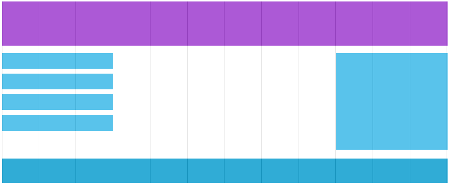
Example 1:
<html>
</head>
</style>
    body {
        font-family: "arial";
    }
    .header {
        background-color: #9933cc;
        color: #ffffff;
        padding: 15px;
    }
    .menu ul {
        list-style-type: none;
        margin: 0;
        padding: 0;
    }
    .menu li {
        padding: 8px;
        margin-bottom: 7px;
        background-color :#33b5e5;
        color: #ffffff;
        box-shadow: 0 1px 3px rgba(0,0,0,0.12), 0 1px 2px rgba(0,0,0,0.24);
    }
    .menu li:hover {
        background-color: #0099cc;
    }
</style>
</head>
<body>

   <div class="header">
       <h1>Website Heading</h1>
   </div>

   <div class="row">
      <div class="col-3 menu">
         <ul>
            <li>Aside Item</li>
            <li>Asidebar Item</li>
            <li>Aside Another</li>
            <li>Aside Item More</li>
         </ul>
      </div>

      <div class="col-9">
         <h1>Responsive Layout</h1>
         <p>A responsive grid-view often has 12 columns, and has a total width of 100%, and will shrink and expand as you resize the browser window.</p>
         <p>Resize the browser window to see how the content responds to the resizing. </p>
      </div>
   </div>
</body>
</html>
Notice that the webpage in the example does not look good when you resize the browser window to a very small width. To fix this we use Media Query.
